












Engineering Blog
Redesigning Better.com’s engineering blog to attract talent.

Giovanni Vocale
Product Design Lead

Yaxin Bai
Illustrator

Erik Bernhardsson
Chief Technology Officer
The Challenge
Better.com was scaling fast — with plans to grow its engineering team aggressively.
The CTO, Eric, wanted to polish the internal engineering blog, which was already in use and being shared with new hires, but lacked visual appeal.
The content — mostly technical posts on backend and data infrastructure — was solid. But the design felt uninspired and didn’t reflect the caliber of work or the engineering culture Better aimed to promote.
Home Page Logo Animation
I composed the logomark alongside the word “engineering” and animated it to expand out of the Better house icon.
My Goal
As a design-minded engineer, I saw an opportunity to elevate the blog’s visual design and use it as a recruiting touchpoint, especially to attract engineers who cared about aesthetics, interaction, and detail — like I did.
My goal was to bring a higher level of craft to the blog’s front-end, making it more engaging, credible, and reflective of Better’s ambitions.
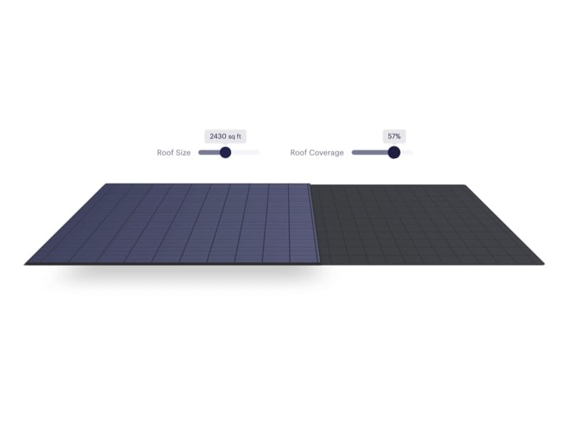
3D Cubes
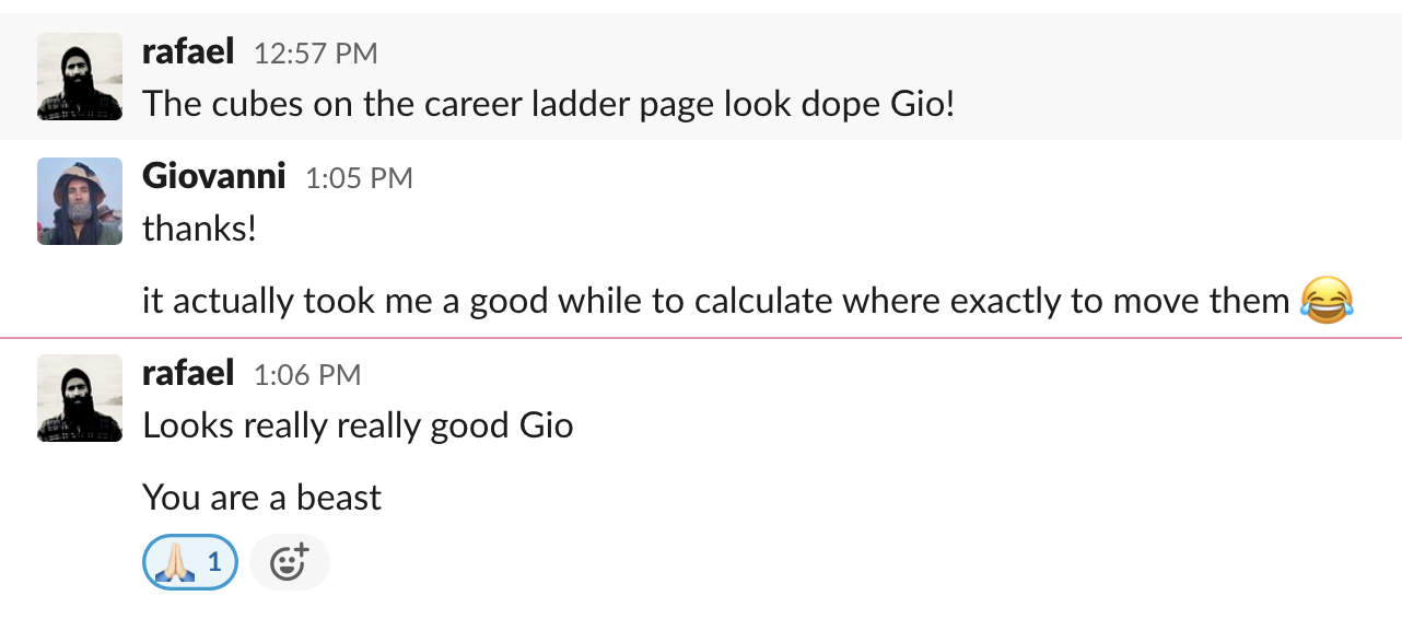
I spent a good amount of time on the career ladder section, pushing 3D cube animations to the edge — aiming for visual impact without distracting from the content, and making sure everything worked smoothly across breakpoints.
What I Did
Redesigned the blog’s layout and visual design — improving readability, typography, and overall clarity.
Hand-crafted custom CSS for precision and polish, keeping the site fast, lightweight, and dependency-free.
Aligned the design with Better’s brand tone without overwhelming the technical voice of the blog.
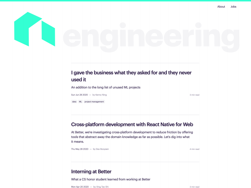
The Article Page
I’ve always admired Medium’s approach to content design, so for this page, I focused on creating a strong, clean, comfortable reading experience.
I used large, highly legible text with generous line height, carefully set maximum paragraph widths, and consistent spacing between paragraphs to improve flow.
Hyperlinks were styled clearly and accessibly — the goal was simple: great typography that gets out of the way and lets you read.
Working Together
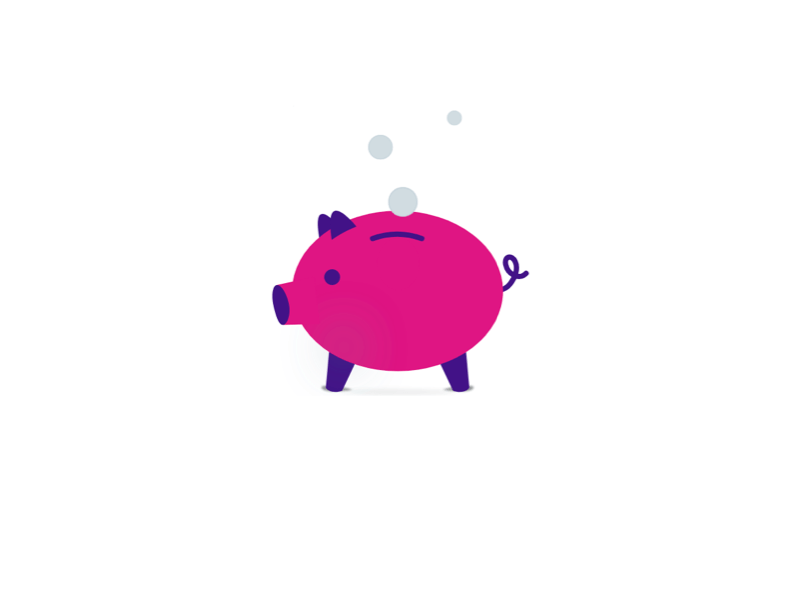
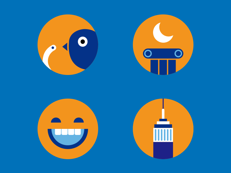
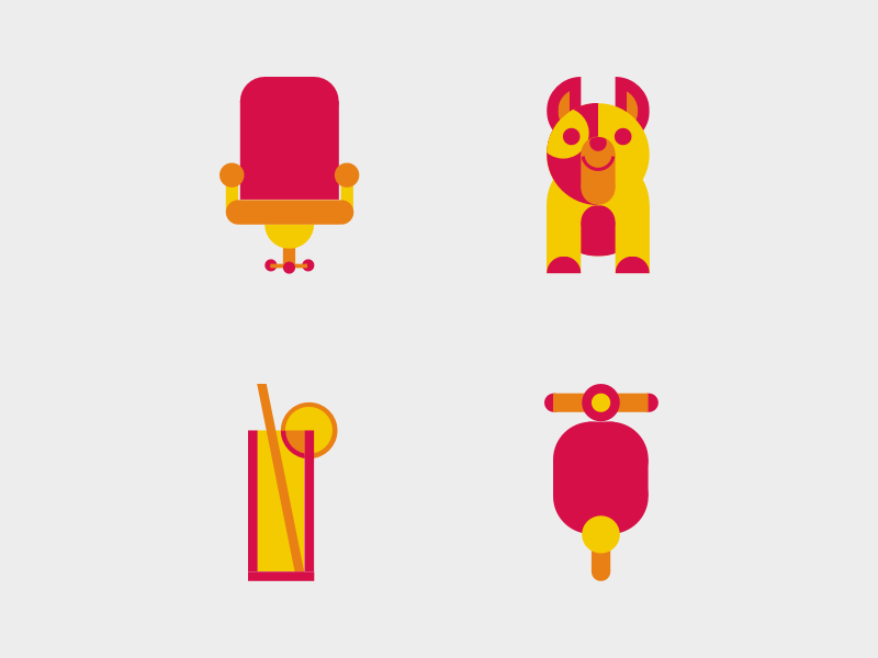
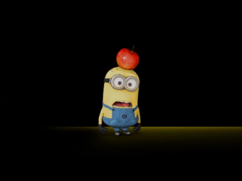
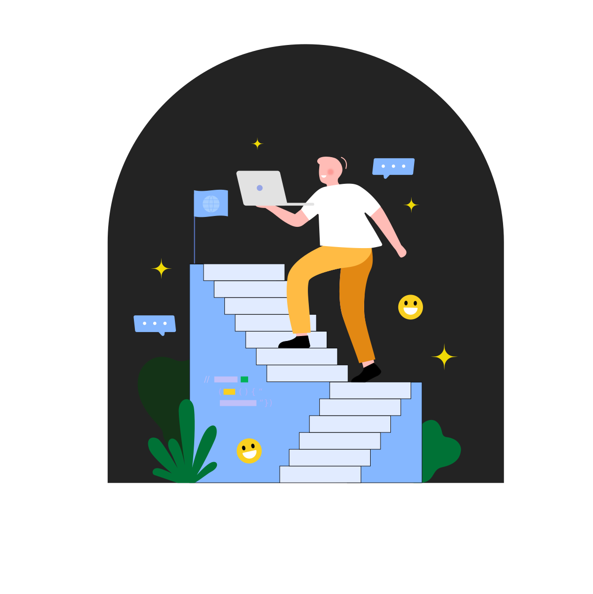
I executed the project independently and reached out to Yaxin, a talented illustrator on the team, to contribute an illustration for the homepage.
She shared four beautiful variations with different color palettes. I selected one, exported it from Sketch as an SVG, and added subtle animations using React Spring.
Everything else — layout, styling, and implementation — I handled myself. Once launched, engineers continued contributing posts via pull requests, and the publishing process remained seamless.
Animated Illustration
To bring the illustration to life, I added a parallax effect that responds to mouse movement.
As users move their cursor across the screen, the character wobbles subtly, adding a playful, dynamic touch that makes the page feel more lively and interactive.
Design Notes
Finally had the chance to use React at work — I’d been a fan for a long time, and this was the first opportunity to just go for it.
Looked at siteinspire.com for ideas.
Went for a strong, bold, monochrome look.
Took Better green and made it more acid 🍋🟩.
Added a strong, subtle overlay grid — a nod to how everything was engineered.
Asked Yaxin for an illustration.
Sketched parallax scroll ideas using React Spring.
Got inspired by hugeinc.com for large stat layouts.
The About Page
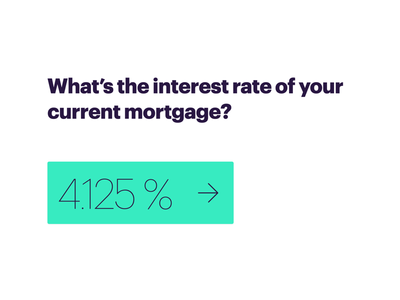
Since I didn’t have many visual assets to work with, I used large numbers to create a sense of scale and impact.
Tech Stack
Better.com’s main front-end stack was Ember, and that’s what I had been working with throughout my time there. But React was slowly making its way in, and this project gave me a chance to use it.
I built the blog with React, animated elements with React Spring, and styled everything with vanilla CSS — no frameworks, just clean, handcrafted styles.
Jobs Page
I fetched available job listings from Greenhouse, a third-party job board, and displayed them directly on the page.
Outcome
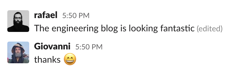
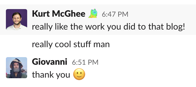
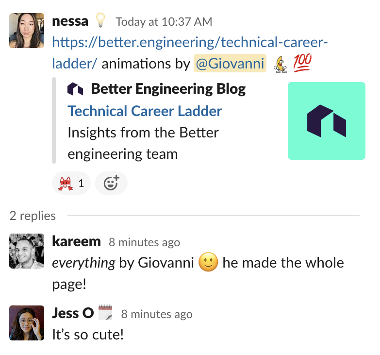
I don’t have hard metrics, but I did receive positive messages from engineers — both new hires and long-time team members — complimenting the blog’s look and feel.
My hope was that the design signaled something more: that Better cared about craft, and that design-minded engineers could feel at home here. Maybe it helped someone feel like, “Hey, this team actually cares about CSS — I can push on this.”
Sometimes, that quiet signal is all it takes to spark the right kind of interest.