




















Giovanni Vocale
Senior Visual Designer
↓
Product Design Lead
Alastair Halliday
UX Director
The Process
I started designing in Sketch, but quickly moved to working directly in code — I wanted tofeel the page in the browser, experiment withanimation, and better understand how the layout would respond across breakpoints.
To integrate with Better.com’s stack, I learned Handlebars.js on the fly.
I then simplified the layout by removing visual clutter, adding white space, and eliminating unnecessary borders. Finally, I brightened the color palette and added subtle animations to bring the page to life.
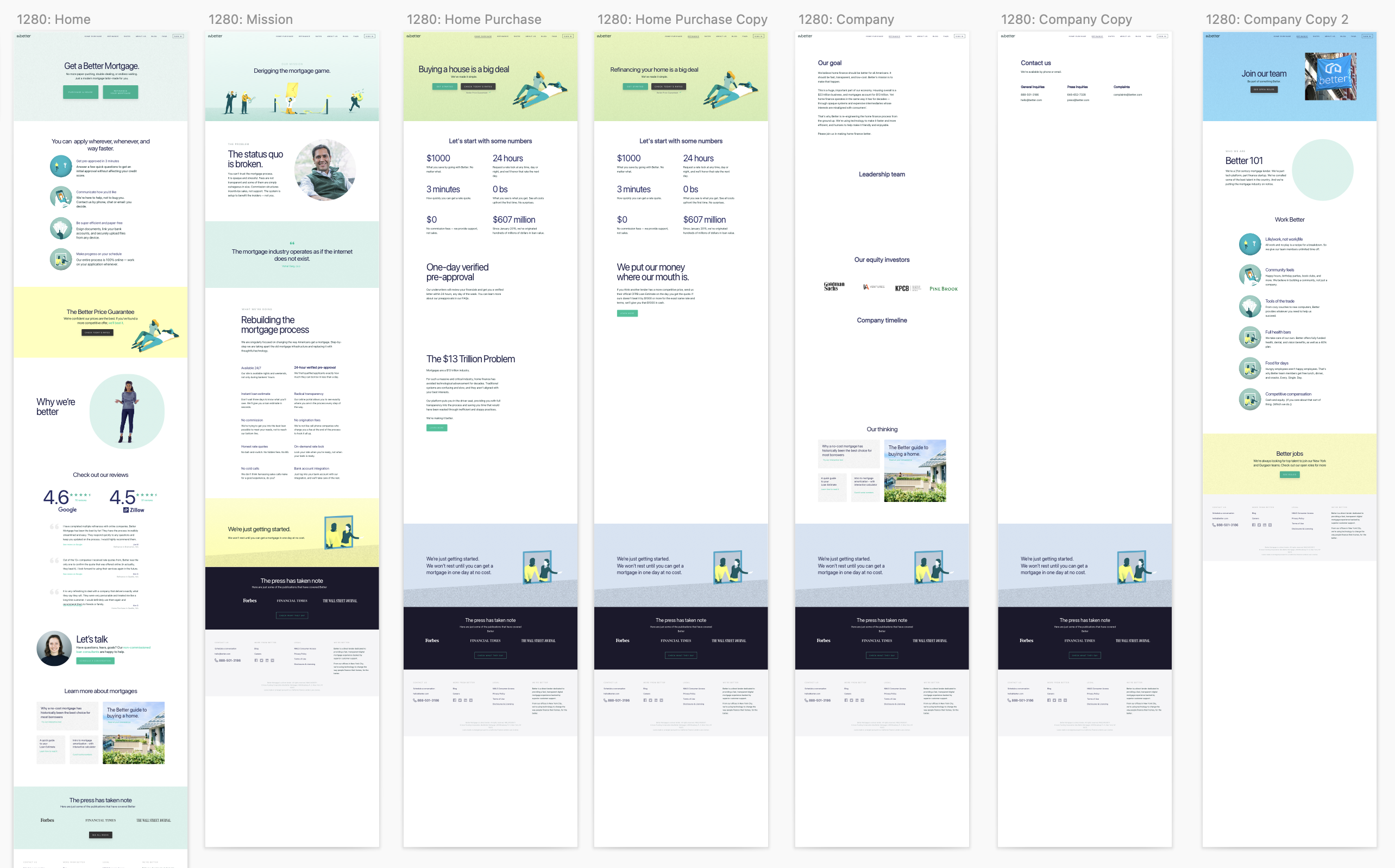
Initial Sketch files
My original Sketch files. I worked on it for a day or two, but then quickly opted to work directly in code.
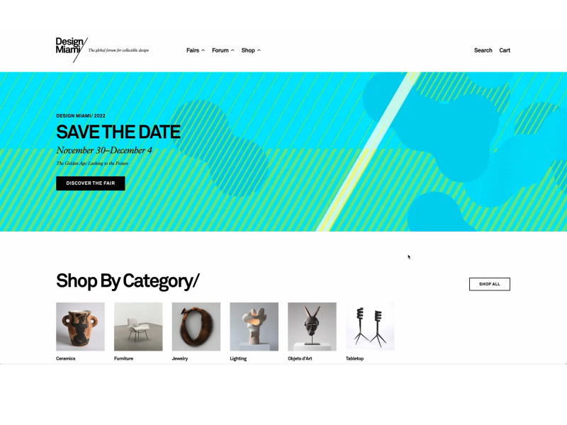
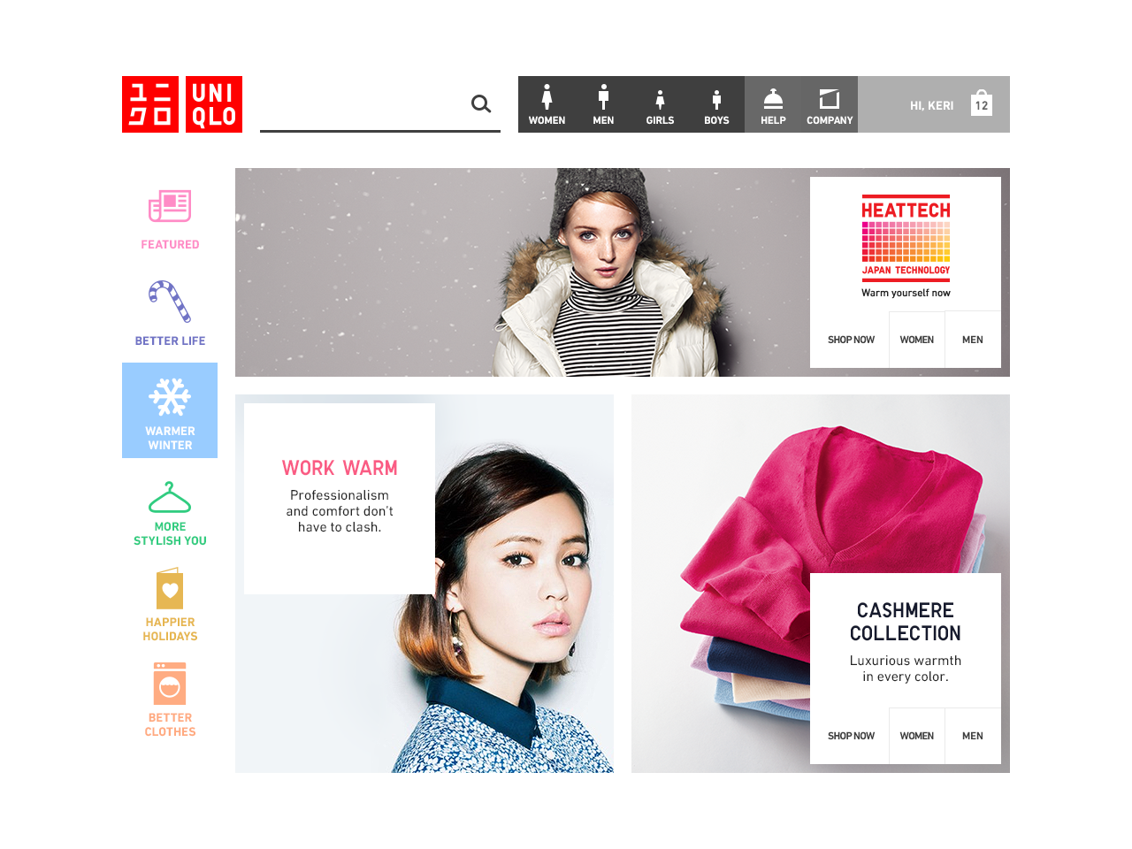
Onboarding Start Pages
About Page
FAQ Page
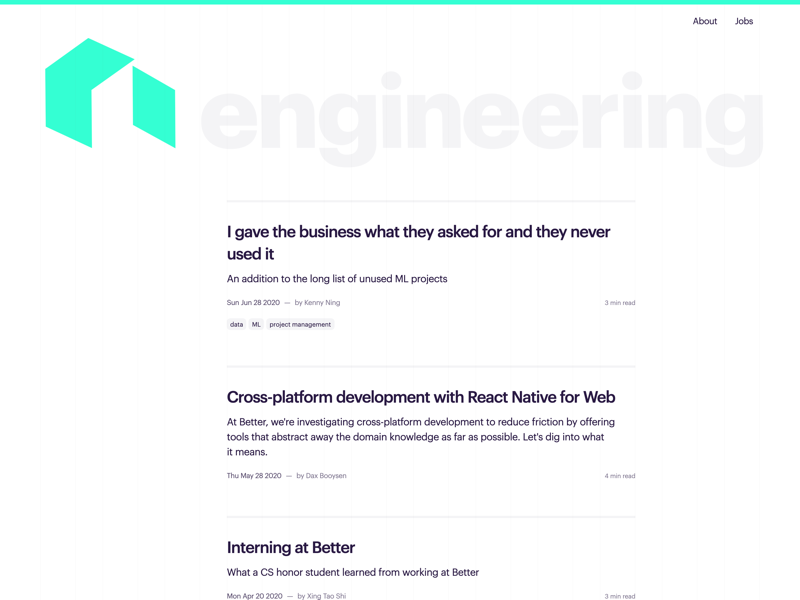
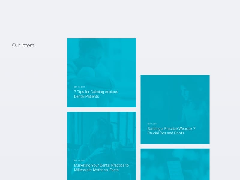
Blog Page
Mobile Homepage
Animated Google Ratings
Animated stars and 4.6 rating counter. The rating was fetched
Odometer Counter
Using odomotere.js, Better had just reached 2 billion funded mortgages
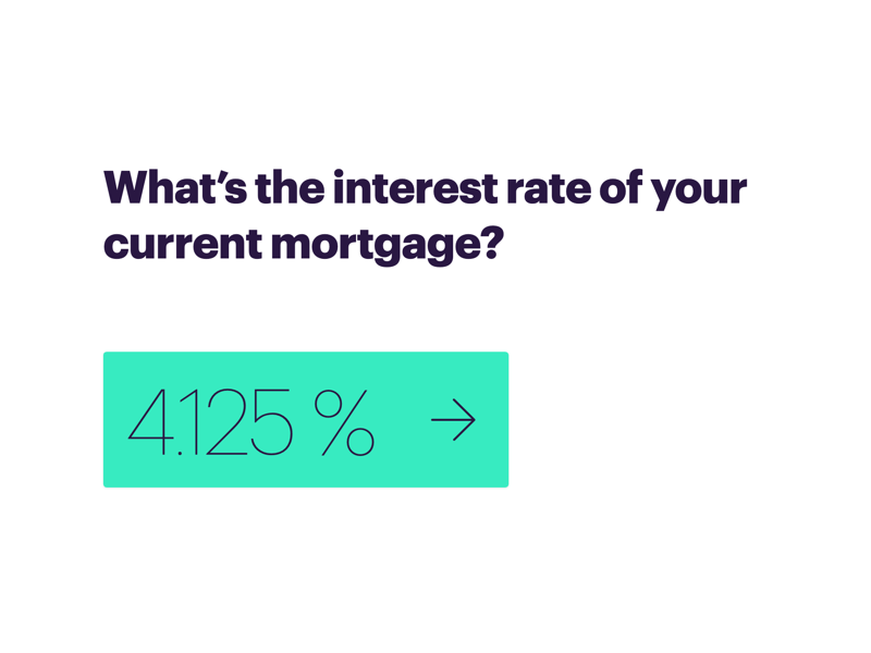
View Rates Button
Splits into Purchase vs Refinance
Callout Hover
The Outcome
Sparked excitement across the org, with positive feedback from design and engineering.
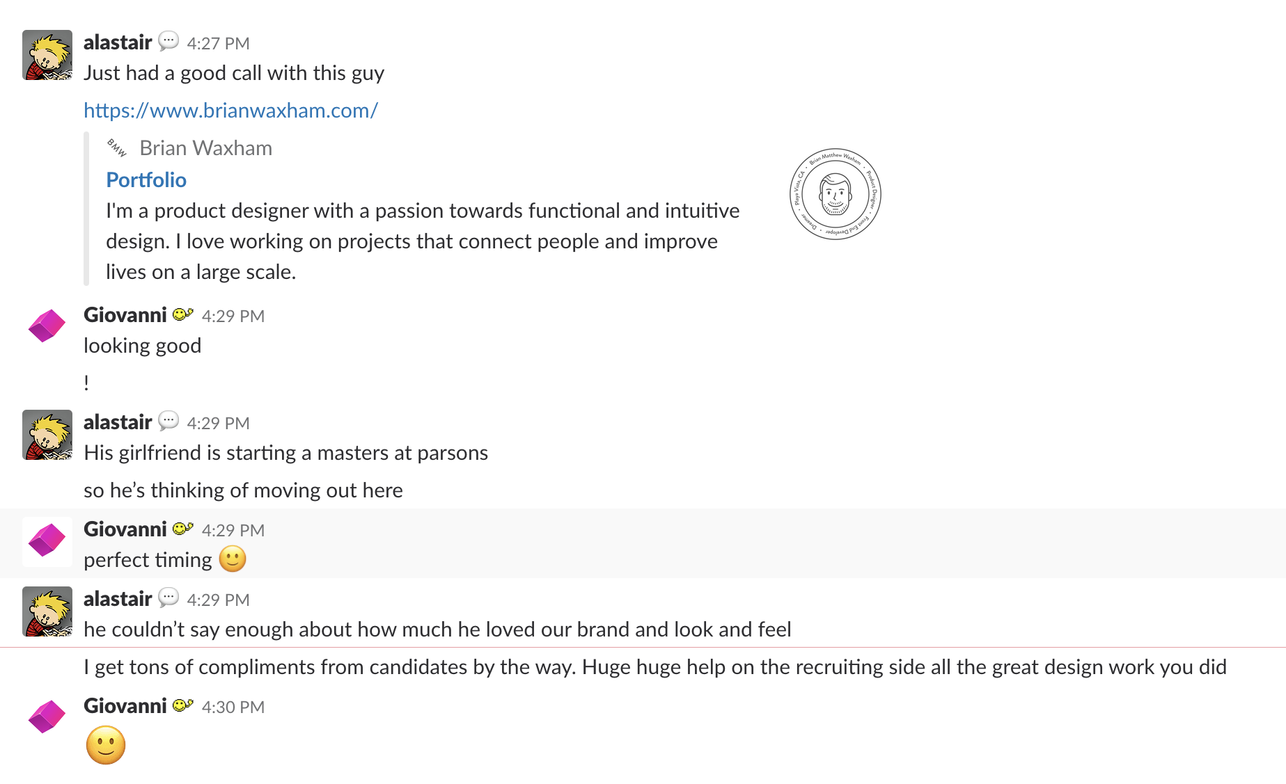
Helped make it easier to hire designers, by giving the company a more modern, creative face.
Challenges
Coding with a broken arm.
Tight deadline, with pressure from the CEO to launch.
Frontend engineers who worked on old homepage blocking my PRs complaing against my CSS style.
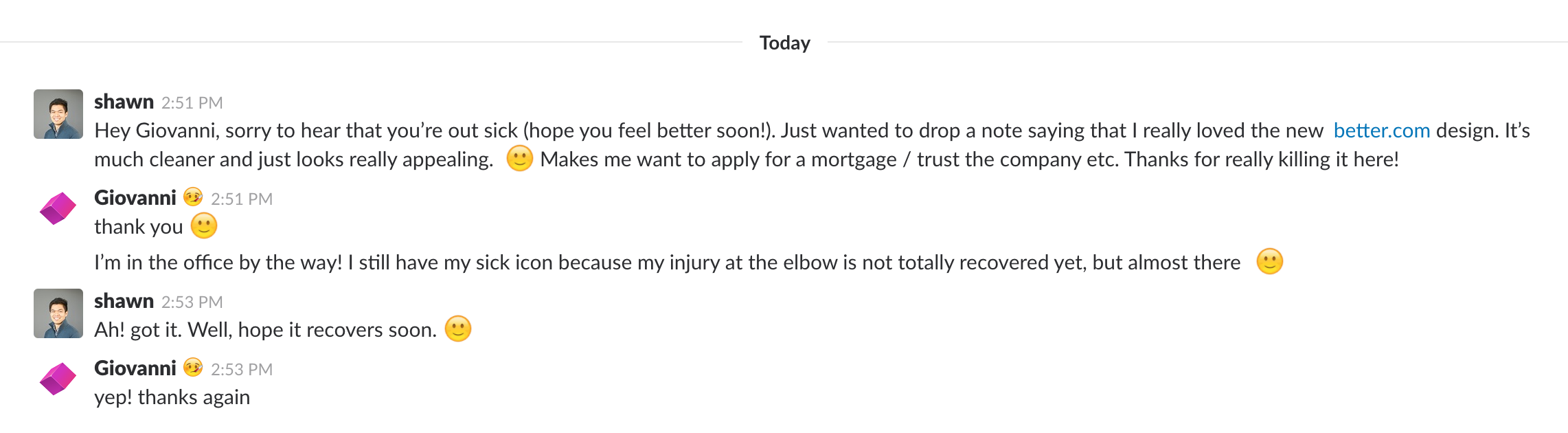
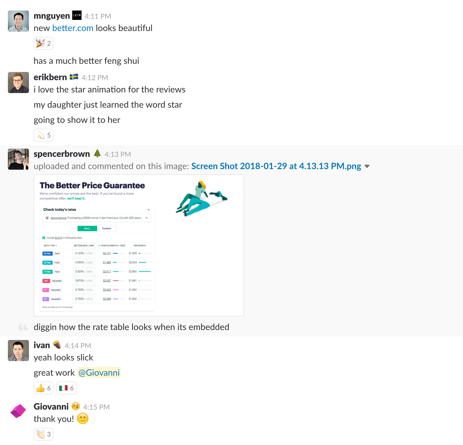
Better Than Before — and After
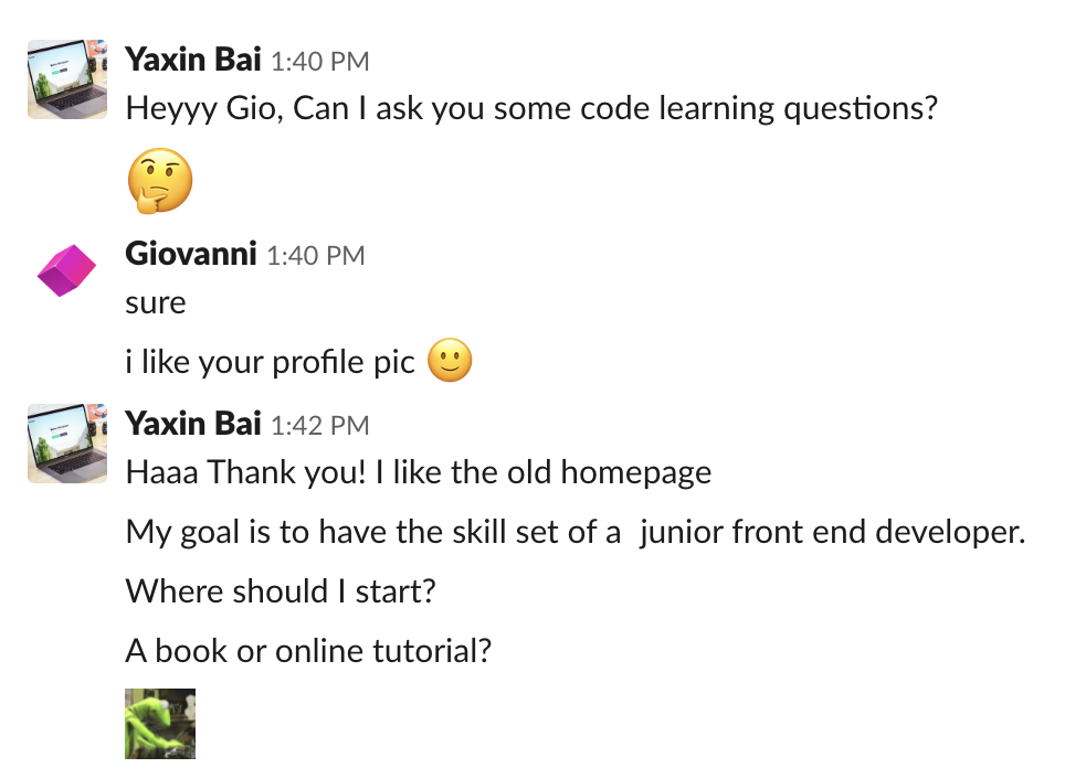
The redesign ended up being more liked than both the previous homepage and the one that came after. It struck a balance between clarity and energy that resonated across the company.
After
The homepage that came after mine took a year of internal work to launch, including 3 months of engagement with an external agency.
Expect the homepage, most of the other pages remained the same as the ones I did.
In comparison, it took me a month to design and code the homepage and all its internal pages.
Adding the blog less the two months total.