









































Giovanni Vocale
Senior Visual Designer
↓
Product Design Lead
Alastair Halliday
UX Director
High Stakes, High Volume
It handled a firehose of data: 100+ new loans per day, thousands in the pipeline. The people using it were under constant pressure — but with the right tools, even rookie hires could outperform seasoned mortgage veterans at other companies.
Sales Pipeline
Loans will be grouped into different sales pipelines and assigned to different loan officers.
Sidebar
The sidebar could be collapsed, and the pipelines could be filtered and sorted.
Pipeline Groups
Managers could group sales pipelines, create filters and assign them to different team members.
Drag and Drop
Managers could drag and drop pipelines to reorder them, or create new ones.

Retrofit Mode
Engineers would often ship the first raw version of a feature — usually just getting the data on the page.
I’d step in afterward to refine the experience: restructure the layout, swap out clunky components, simplify the flow, and add micro-interactions or animations to make it feel polished and intuitive.
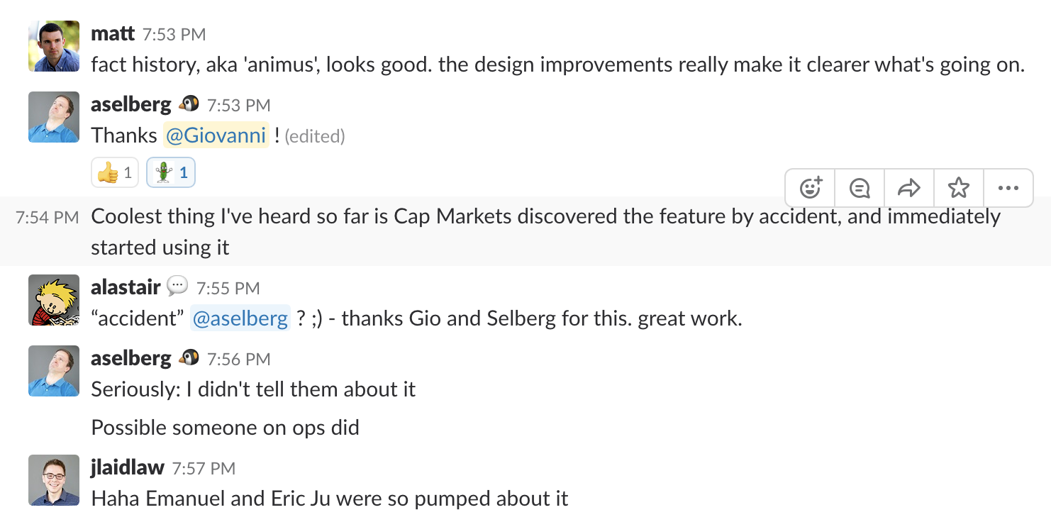
Fact History
A way for underwriters to peak into any saved fact associated to a loan.
Manual Fact Editing
Users could override manually some fact associated to a loan, in case the machine made an error.
Trigger Analyzer
Users could visualize why a certain activity was triggered or not. What inputs were needed to trigger it, and what was the outcome.
We shipped fast
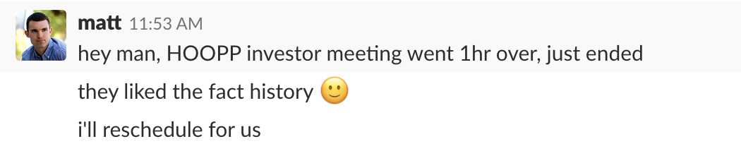
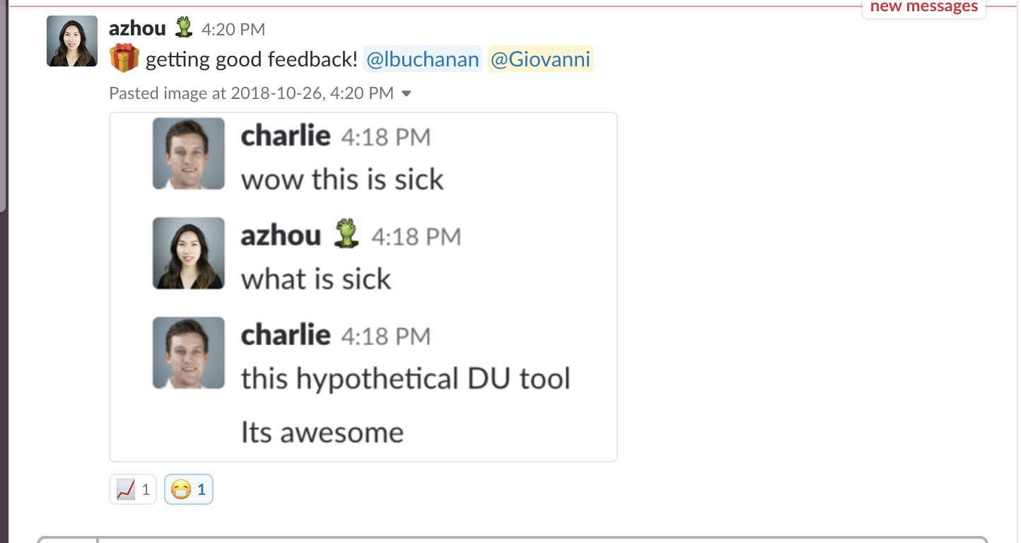
Most features were released within days, behind internal flags, to selected beta testers.
Feedback came in real time via Slack or direct comments from power users. I’d quickly iterate, polish, or debug — and if feedback was good, we’d launch to everyone.
The new Loan Files view
A table to see all the active loan applications, with filters and sorting options.
It replaced the older Activities view, which was grouping loan by activities instead of by loan files and didn't prove as useful as the new view.
Advanced Filters
Much more powerful and flexible filters, allowing underwriters to find loans by virtually any criteria.
Performance Improvements
I kept a close eye on page performance, identifying bottlenecks and optimizing them to keep everything running smoothly.
Organize Columns
Underwriters could rearrange columns, decide which ones to show and the selected settings will be persistent.
This was not relying on external library, since the Ember ecosystem lacked a good one, but a custom implementation.
Resize Columns
Underwriters could resize columns to make the view more comfortable.
This was not relying on external library, since the Ember ecosystem lacked a good one, but a custom implementation.
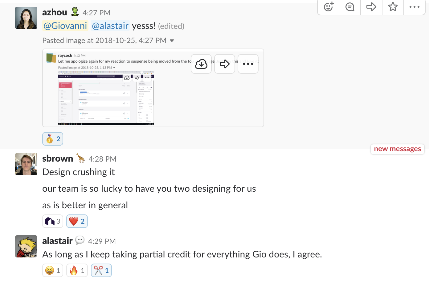
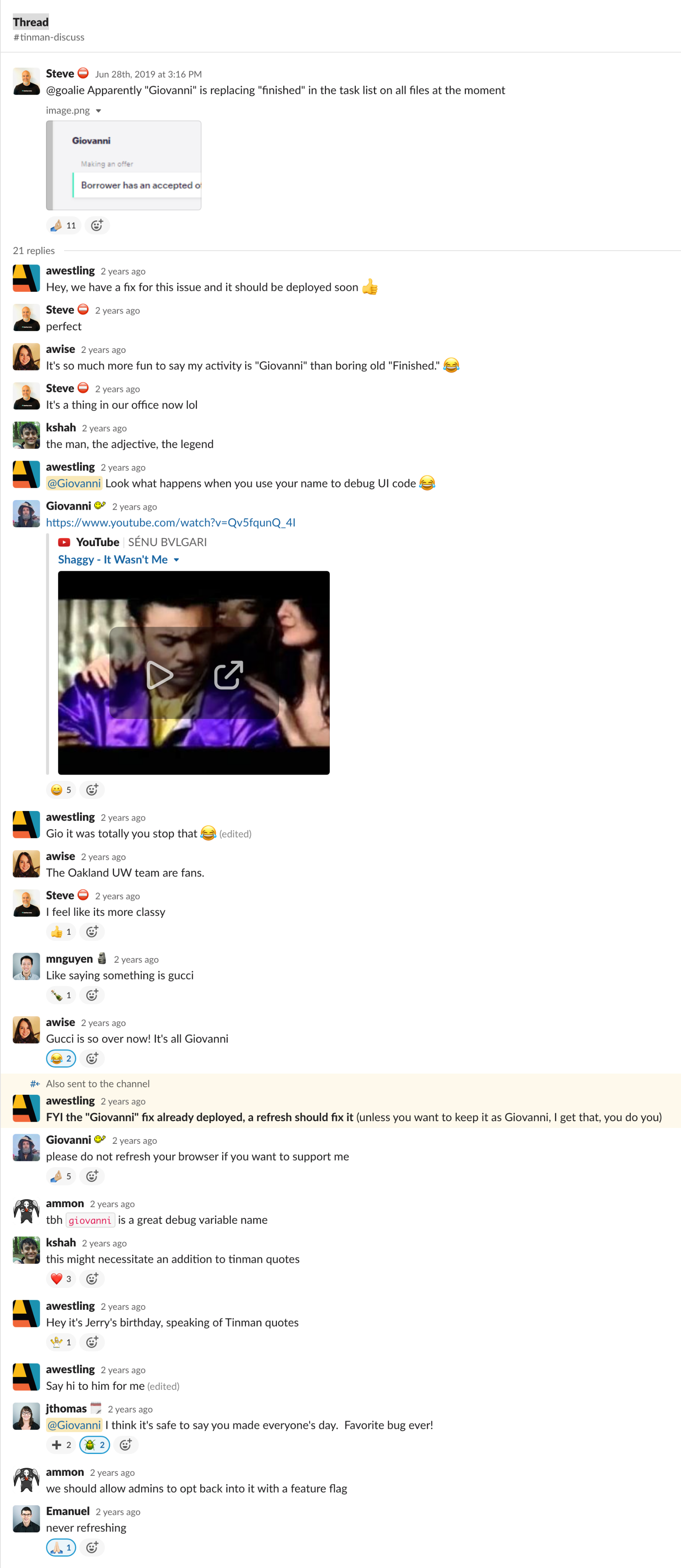
The infamous Giovanni bug. Made a good laugh across the company.
What I focused on
Information hierarchy – Bundling related data together, collapsing noisy views, surfacing what mattered most.
Speed + keyboard UX – Built for power users with fast flows, shortcuts, and snappy transitions.
Micro-interactions – Smooth loading, feedback, and drill-downs for a more fluid experience.
Accessibility – Solid color contrast, focus states, and full keyboard navigation.
Data-first design – Designed with real data from the start to handle edge cases gracefully.
Pricing
A tool used by sales people to simulate loan pricing when on the phone with a customer.
Animations
Whenever possible, I used subtle animations to reinforce interactions and make complex concepts easier to understand.

Tech Stack
The app was built with Ember.js, and I learned it from scratch. I consistently pushed to keep it up to date to narrow the gap with modern React practices.
There was no Storybook, no typed templates, and no frontend tests Ember.js, and I learned it from scratch. I consistently pushed to keep it up to date to narrow the gap with There was no Storybook, no typed templates, and no frontend tests — only a limited set of Selenium tests maintained by a single QA engineer.
Despite that, I contributed heavily to the codebase — becoming the 4th most active contributor at the company, behind only a few of the earliest engineers on a team of 40.
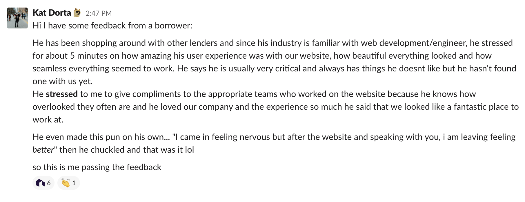
I built strong relationships across the engineering team and earned their respect by making their work look better and feel smoother.

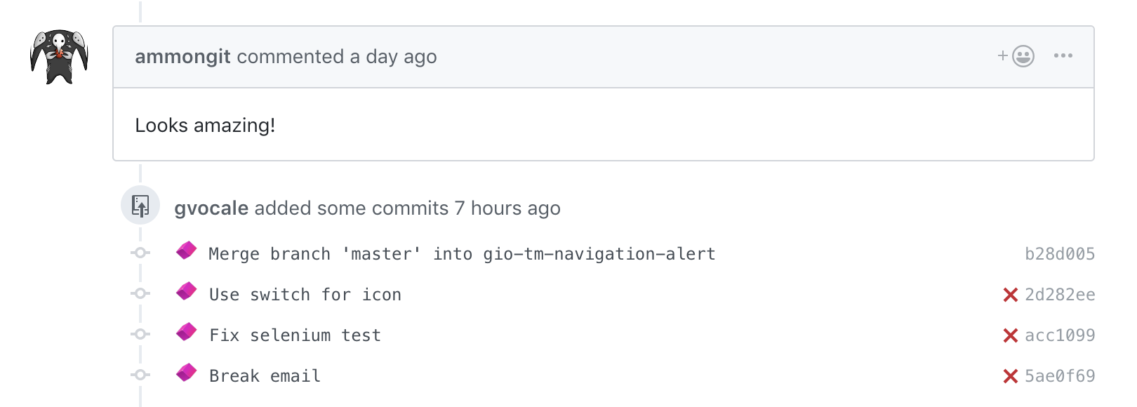

Ticket
A way to create and manage internal issues related to a loan.
Tickets
A way to create and manage internal issues related to a loan.
Create Ticket
A way to create and manage internal issues related to a loan.
Payment Schedule
A history of all payments made for the loan
Campaigns
A way to add discounted rates to certain clients.
Less Time Required to Produce a Loan
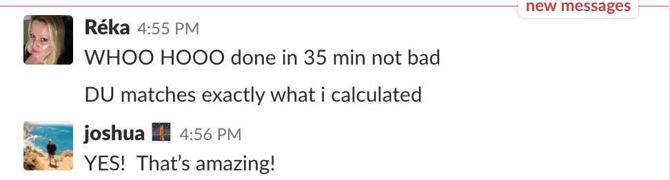
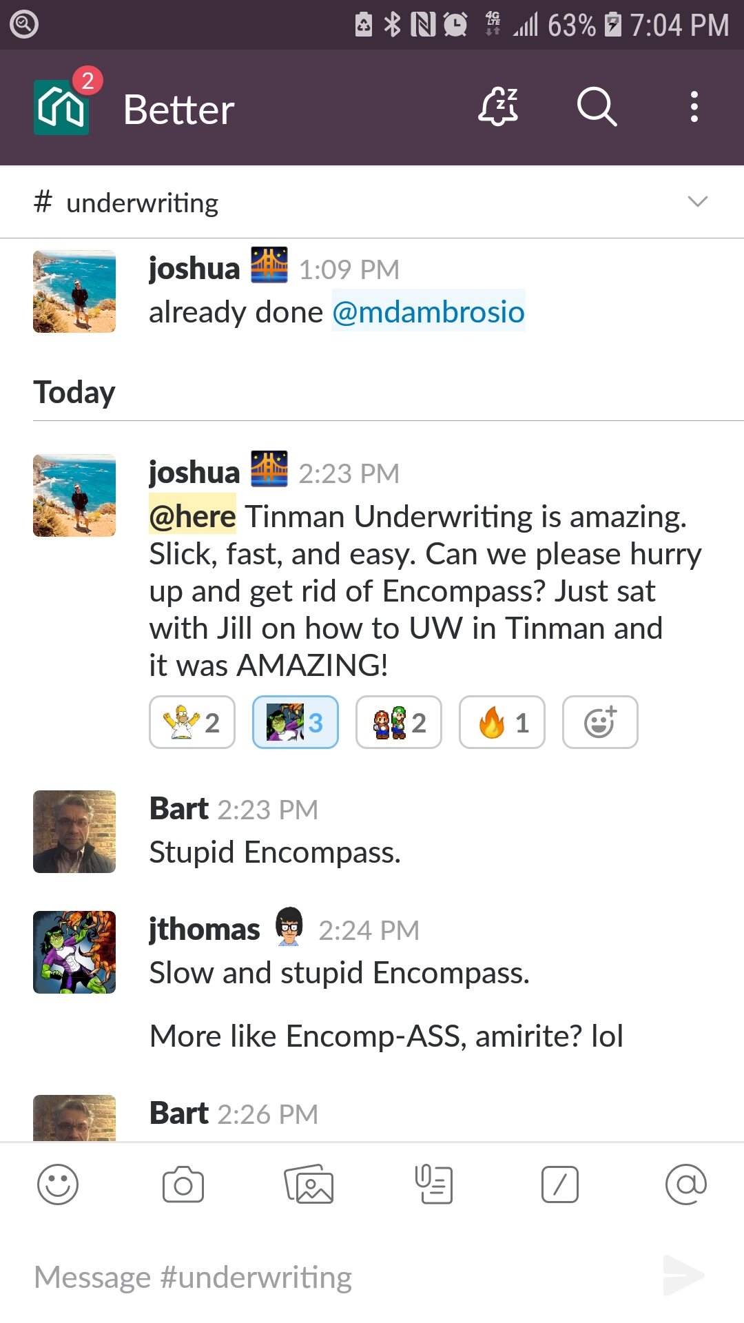
Underwriters were able to underwrite a loan alone in just 35 minutes, which is almost unheard of in the industry. For reference, using Encompass — the industry-standard software — the same process typically takes an entire day.
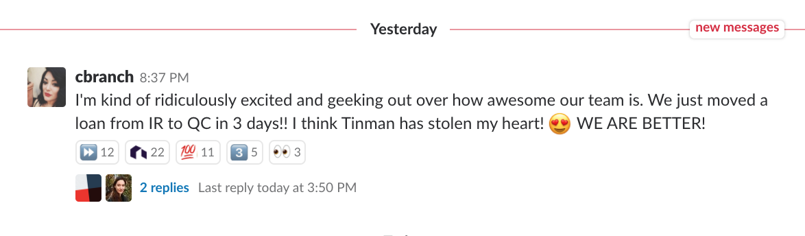
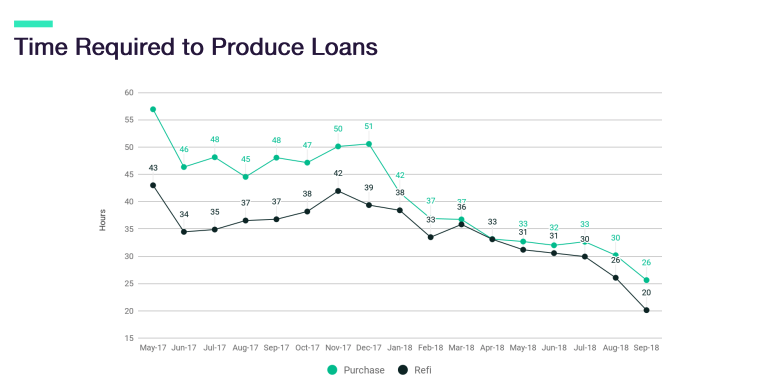
Faster Loans, Bigger Margins
The time needed to produce a loan dropped significantly thanks to improved workflows and automation in Tin Man.
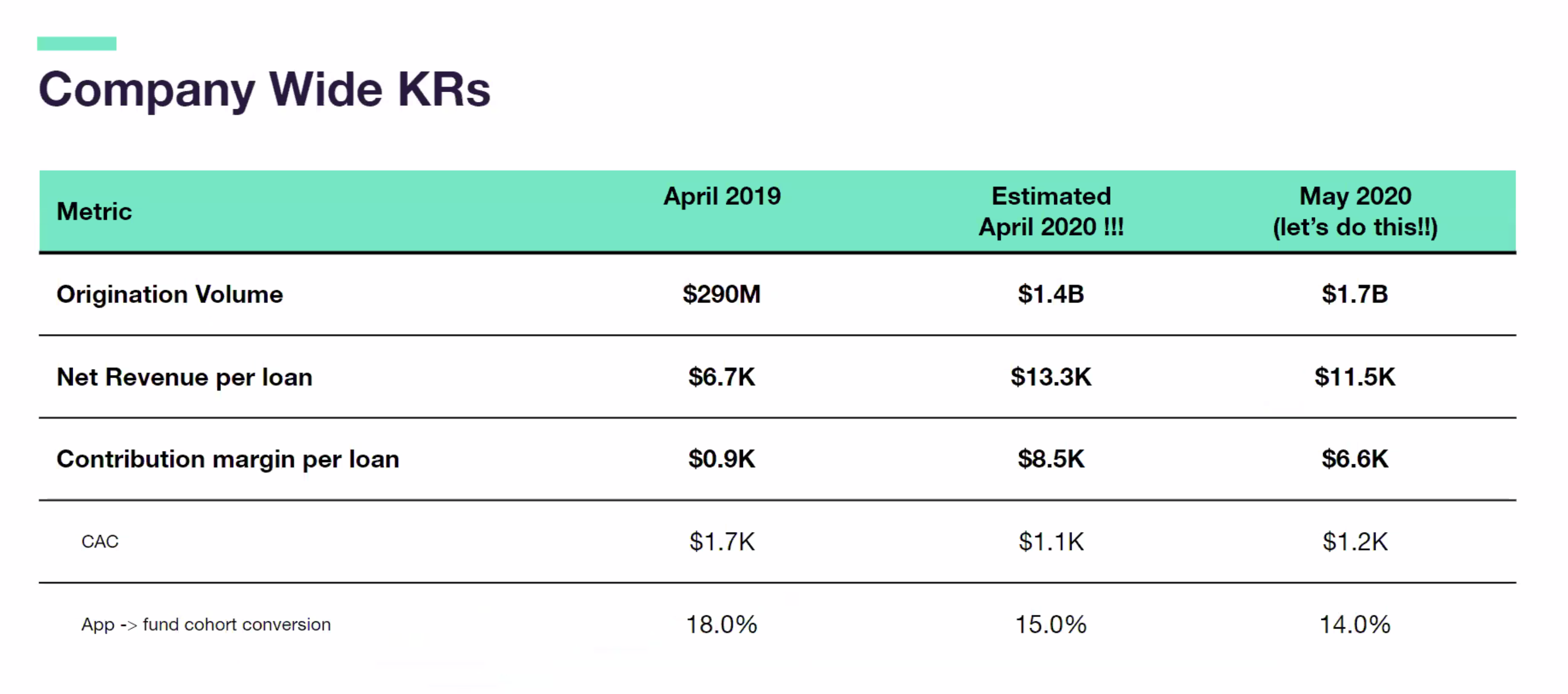
As a result, the company’s margin per loan skyrocketed — from under $1000 when I joined to $8,000 or more after these improvements.
Rookies Crushing It
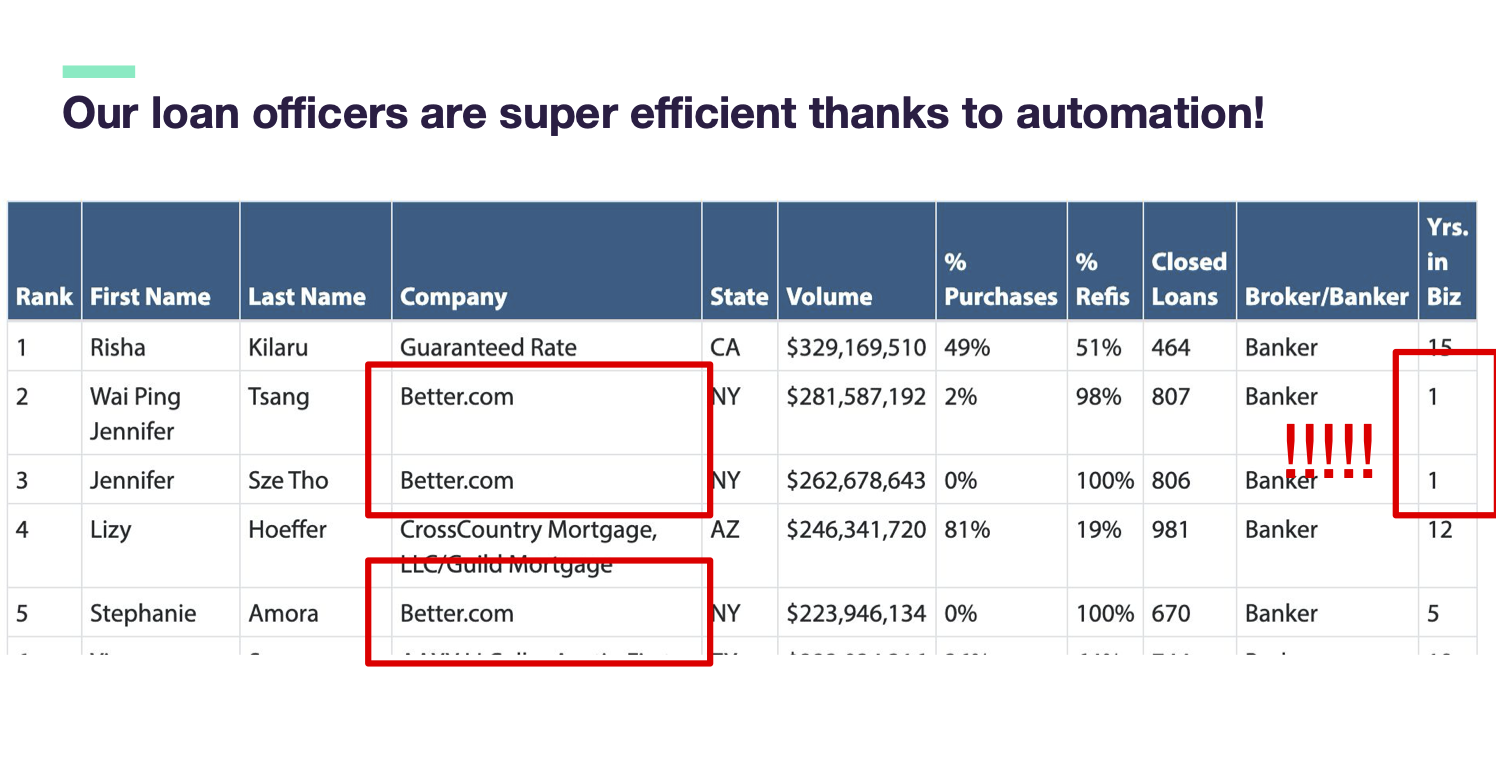
Loan Consultants using Tinman could outperform even those with 10+ years of experience — some were hitting 10× the performance and winning awards for top results.
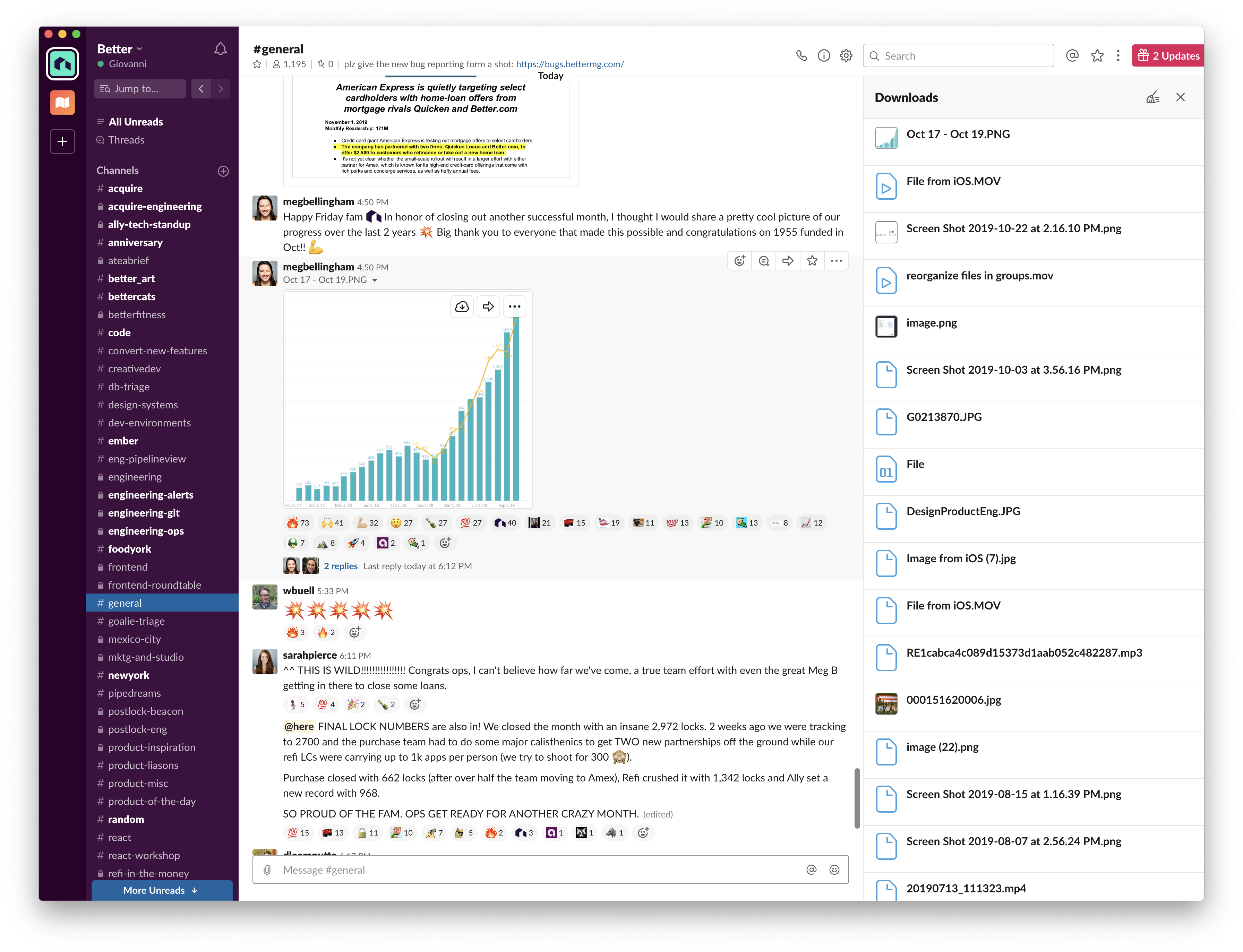
The Tool Behind the #1 Startup
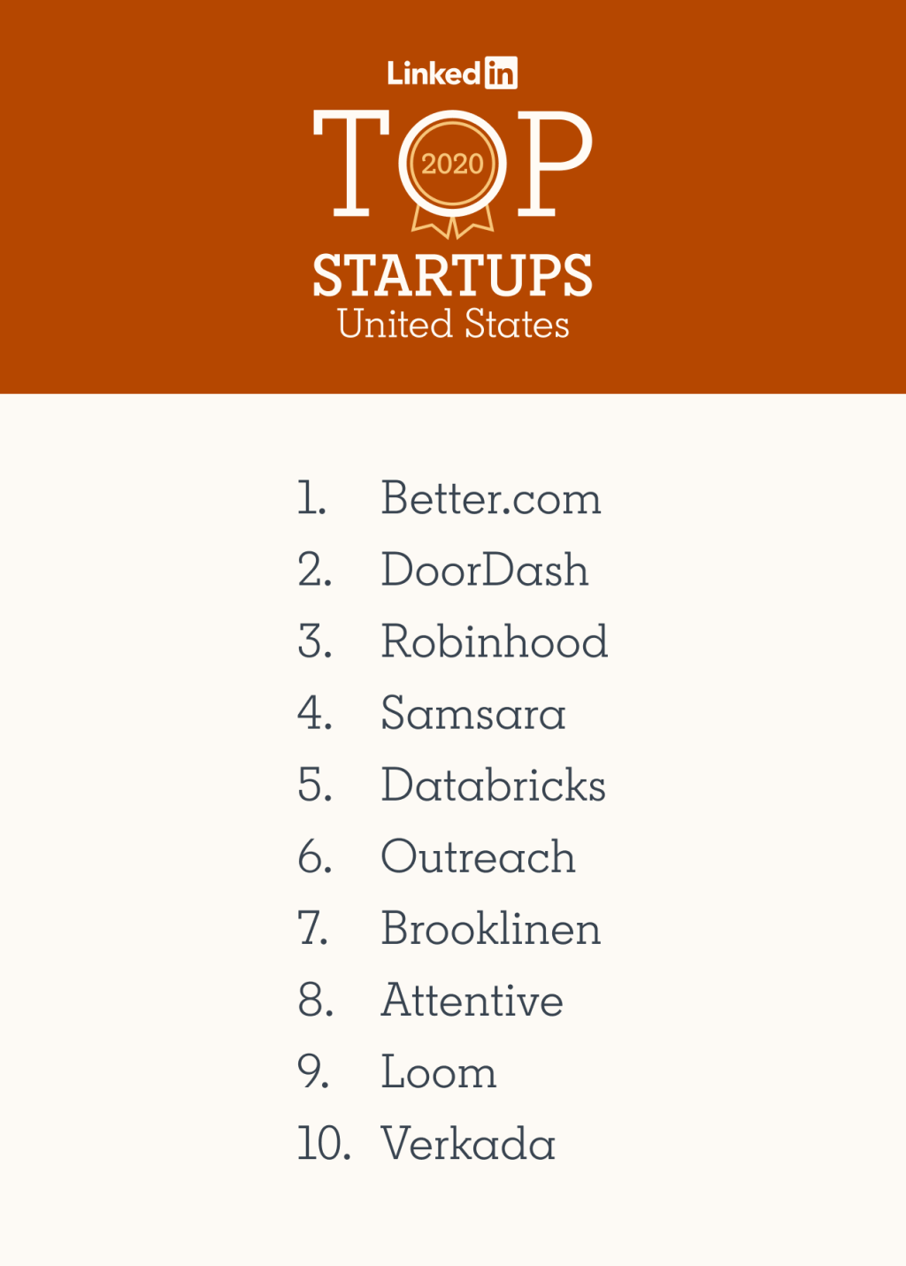
In 2020, Better.com was named #1 on LinkedIn’s Top Startups list — hiring at a staggering pace, onboarding over 1,500 employees since March, with plans to add 7,000 more in the following 12 months.
Most of them would be using Tinman.
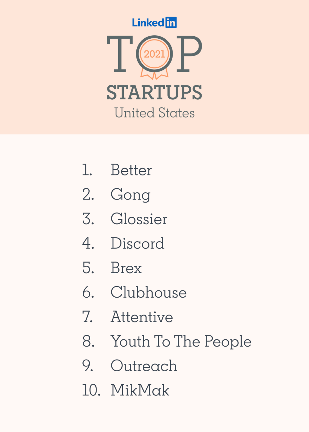
In 2021, Better.com topped LinkedIn’s Top Startups list again.